Intellian Re-branding project
Intellian has grown and evolved over the past 15 years and wish to reflect who we are today and to symbolize our growth into the future. they are evolving from an innovative antenna manufacturer to technology and solution providers empowering satellite communication. They want a new look that represents their current and future position within the market and with their customers.
인텔리안은 지난 15년 동안 혁신적인 안테나 제조업체에서 위성 통신 기술 및 솔루션 제공 업체로 진화해 온 기업입니다. 인텔리안의 현재와 미래의 위치, 고객과의 관계를 대표할 수 있도록 브랜드를 재정의하고 시각화하여 일관된 브랜드 경험을 전달하고자 하였습니다.
C.I renewal
The objective of the rebranding project is to redefine the brand's tone and manner through the renewal of Corporate Identity (CI) and establish a systematic visual system. The goal is to ensure consistent brand communication for Intellian, allowing for coherent branding even amidst business expansion and changes in the satellite communication industry.
Brand essense
-
To be the most advanced, trusted and successful provider of system and technologies with satellite communication
-
To deliver innovative technology that connects and inspires
-
· Relentless in our our pursuit of Excellence
· Empower growth through Innovation
· Invest in partnership
· Driven by our people
-
· We are one global team
· We think creatively
· We demand excellence every day
· We share the same values
NEW identity
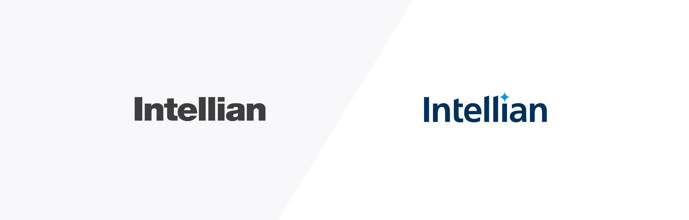
The Intellian logo represents the single standard for leading the future satellite communications industry with the motif of the Polaris, which symbolizes the guiding star. The shapes of the logo express the future-oriented nature of moving forward by adding characters of the diagonal line.
The Logo's Blue color symbolizes the Intellian's high reliability in leading the satellite communications industry with its accumulated technological prowess and innovative processes, through which it communicates with a solid and enterprising image.
Keyword
The Future
Guiding Star / High-performance / High-Quality / Signal Direction
인텔리안의 CI에 활용된 별의 컨셉은 ‘마름모 꼴의 별’이 아닌 ‘북극성(Polaris)’ 입니다.
북극성은 길잡이의 별을 상징합니다. 또한 항상 같은 자리를 지켜오며 영원성을 상징하는 별입니다. Intellian Polaris는 미래의 위성통신 산업을 이끄는 단 하나의 기준을 상징합니다.
북극성과 같이 최첨단, 최고의 퀄리티의 제품을 만들어내는 의미를 상징적으로 표현하였습니다.


Graphic motif, Polaris
Keyword Guiding Star, Revitalization, Defined

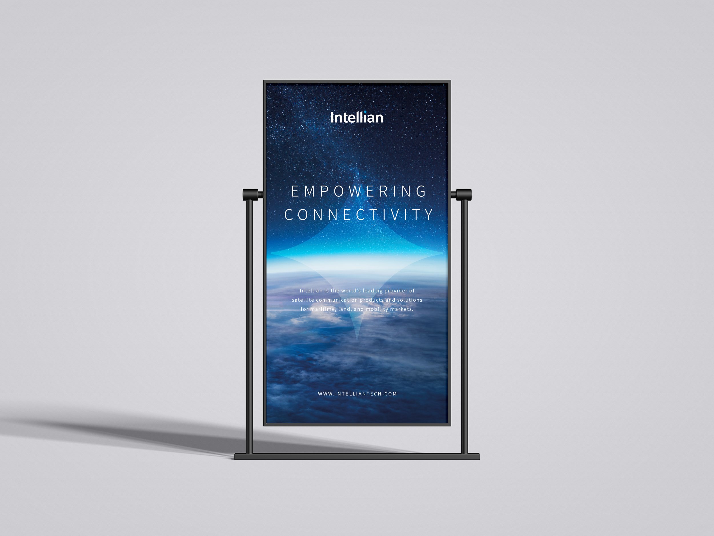
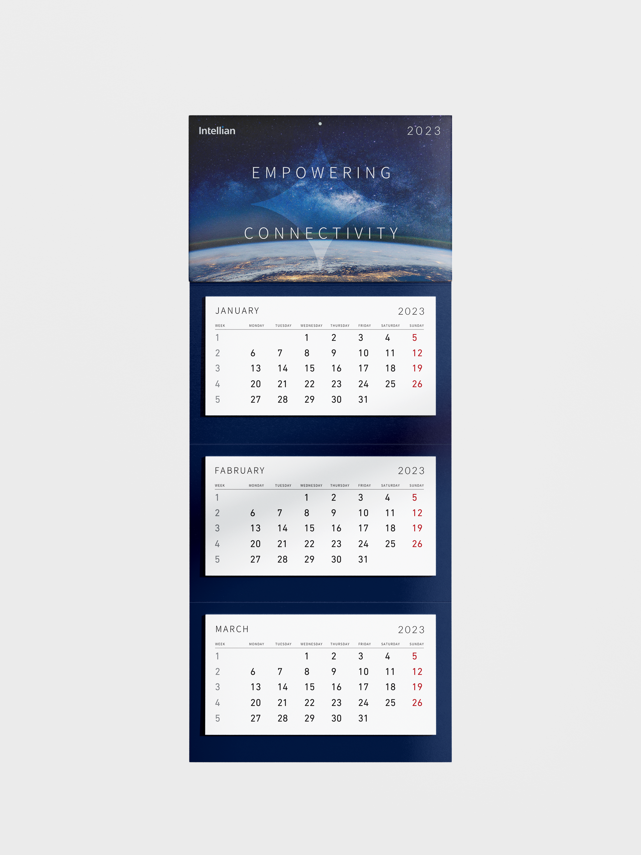
Impowering connectivity.
Connect.
Inspire.
Impowering connectivity. Connect. Inspire.
The concept of the star used in Intellian logo is "Polaris," not "Diamond Star." It means that Intellian is the North Star, the standard that leads the transition of the satellite communication industry. It is also a star that has always been in the same place and symbolizes eternity.
Intellian Polaris stands for the single standard that drives the future satellite communications industry.
Visual system

The connection with the North Star (representative symbolic color of the shining star) used in the logo is expressed in the yellow color, which symbolizes original and positive energy at the same time
Intellian Polaris stands for the single standard that drives the future satellite communications industry.


Type face,
Modern. Clean. Agile.
(English / Korean / Chinese)

Application system
I have redesigned the design assets of Intellian to fit the renewal new identity.
More than 90% of all projects were individually carried out and were carried out in compliance with the basic guidelines of Intellian.


PROJECT OWNER
Intellian
CREATIVE DIRECTION
Superunion(UK)
BRANDING
Project Management - Intellian / Superunion(UK)
Identity Design - Jinah Lee / Superunion(UK)
Graphic Design - Jinah Lee
Application Design - Jinah Lee